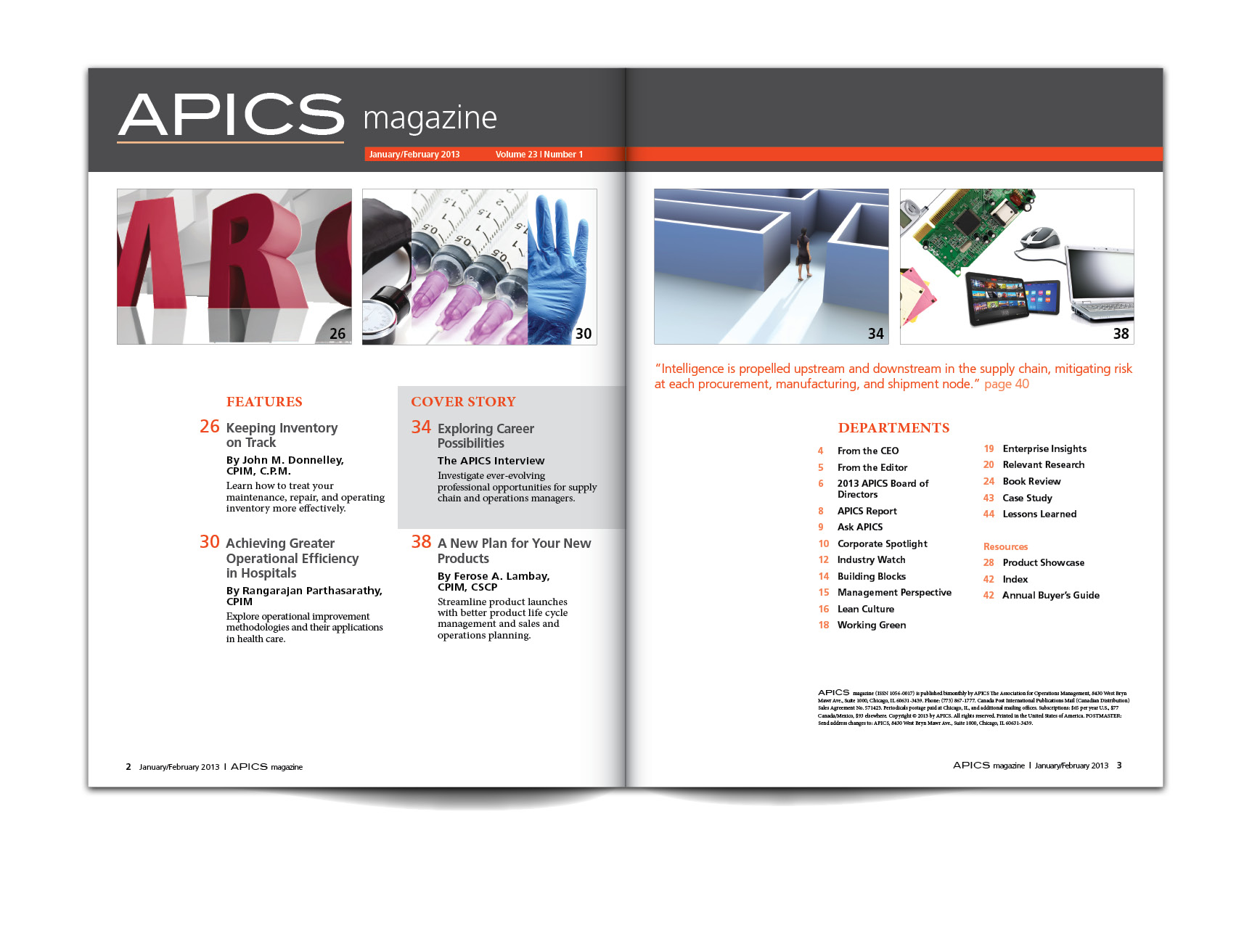
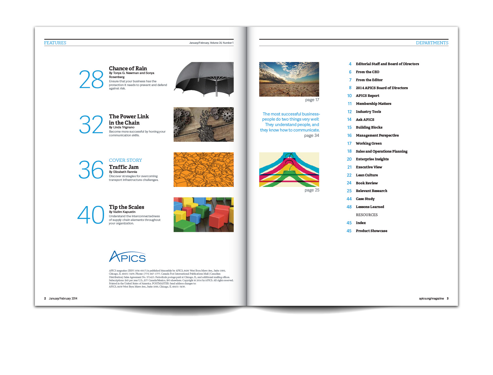
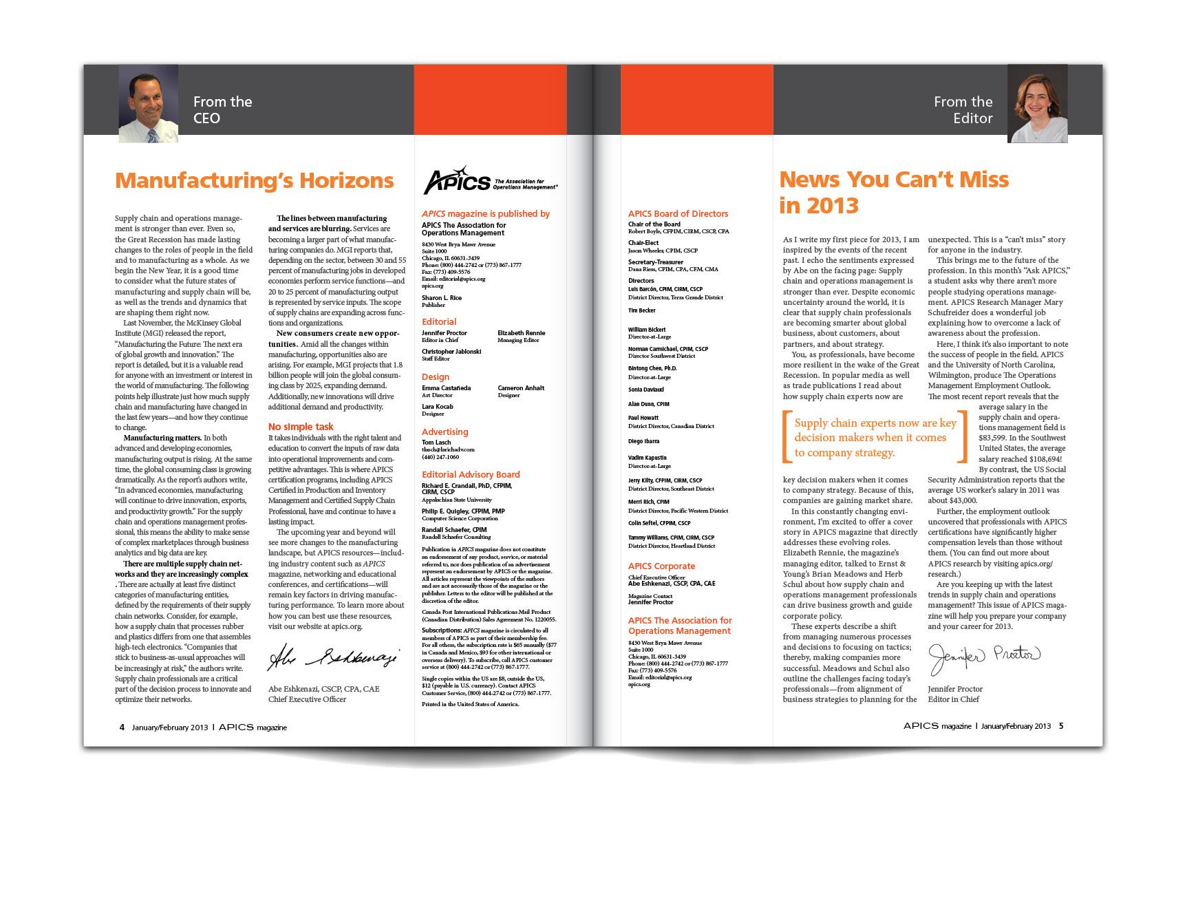
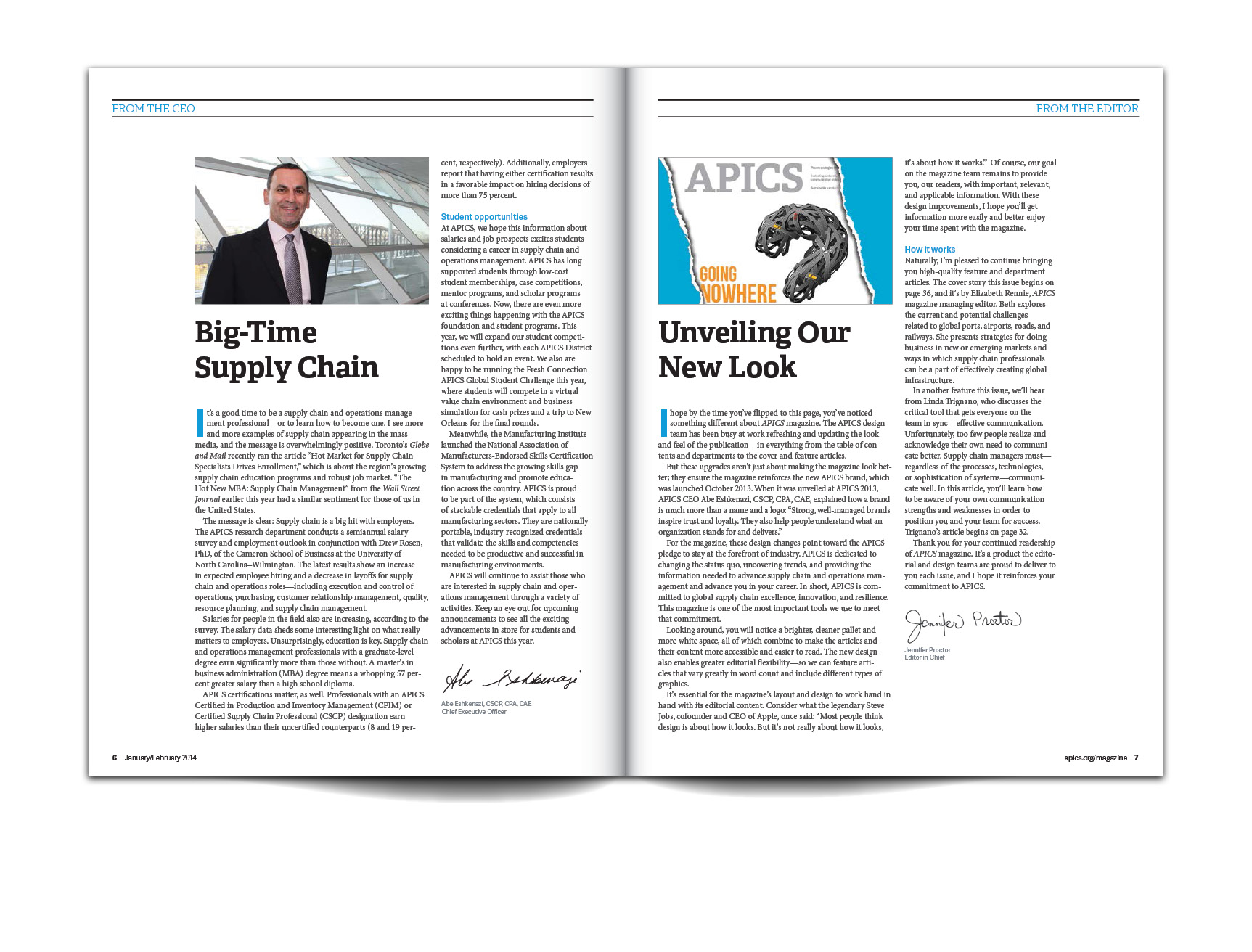
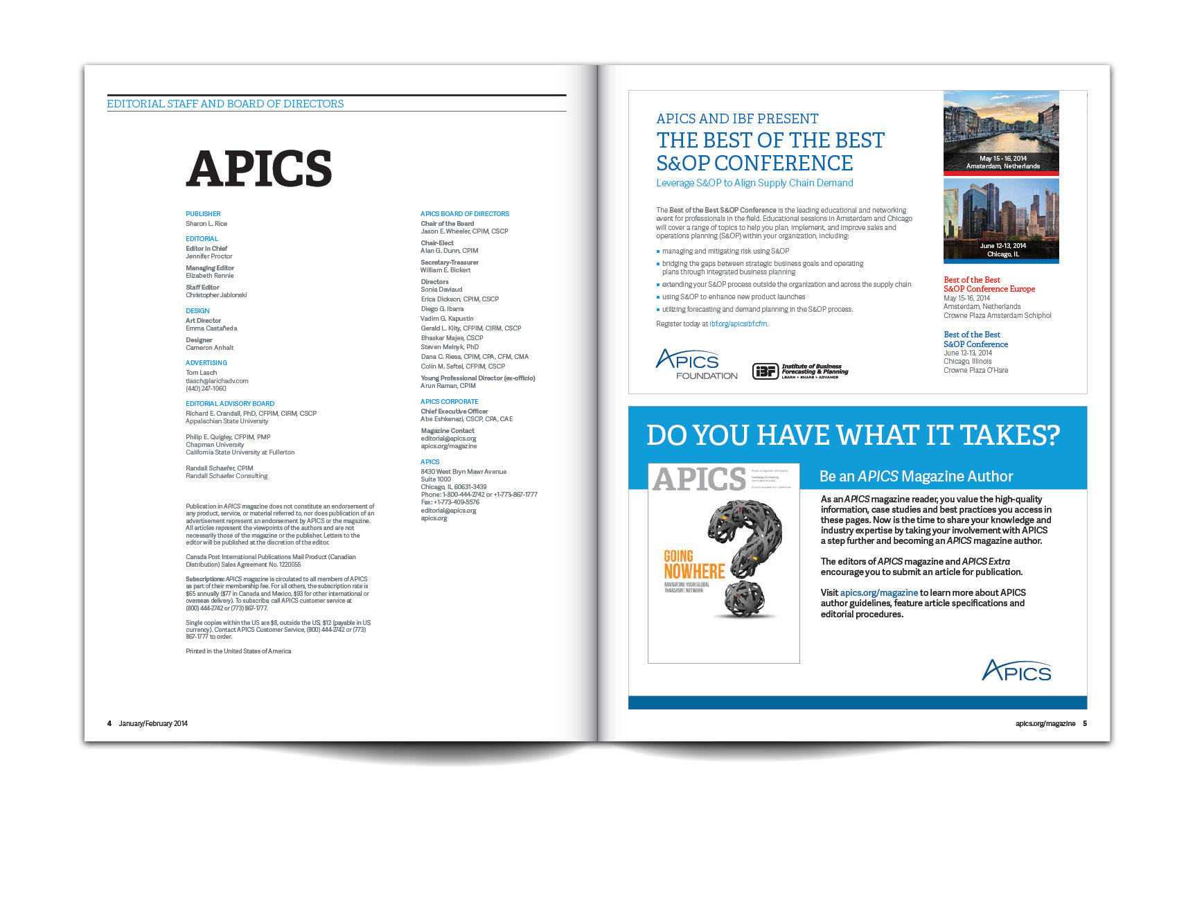
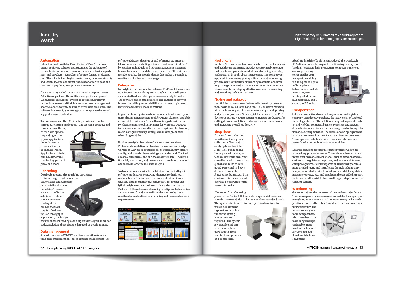
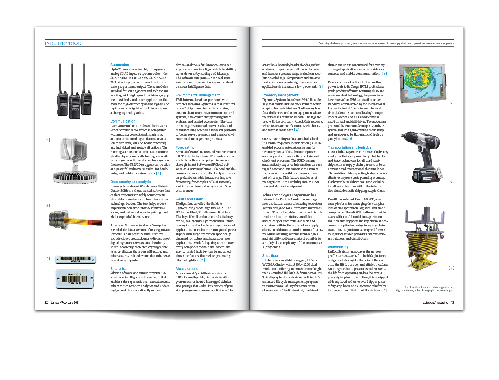
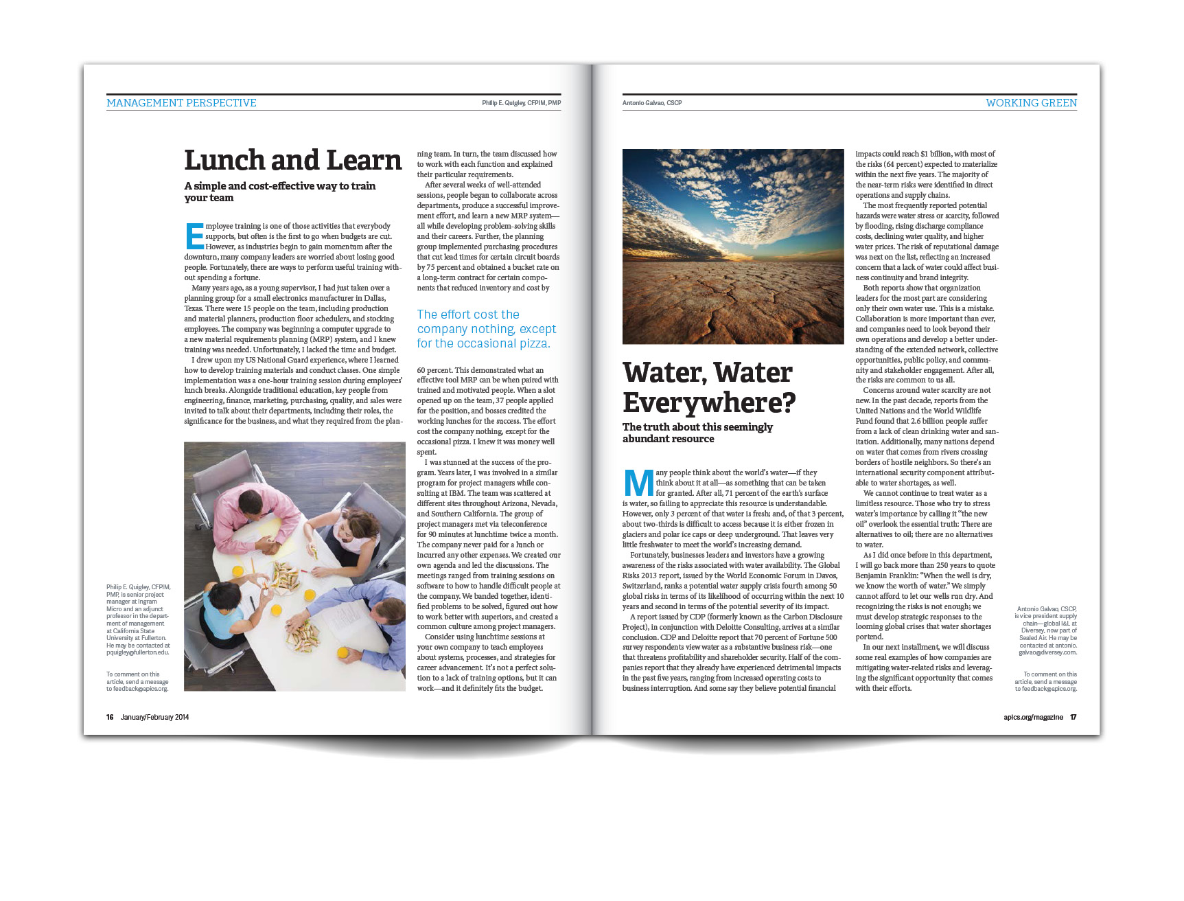
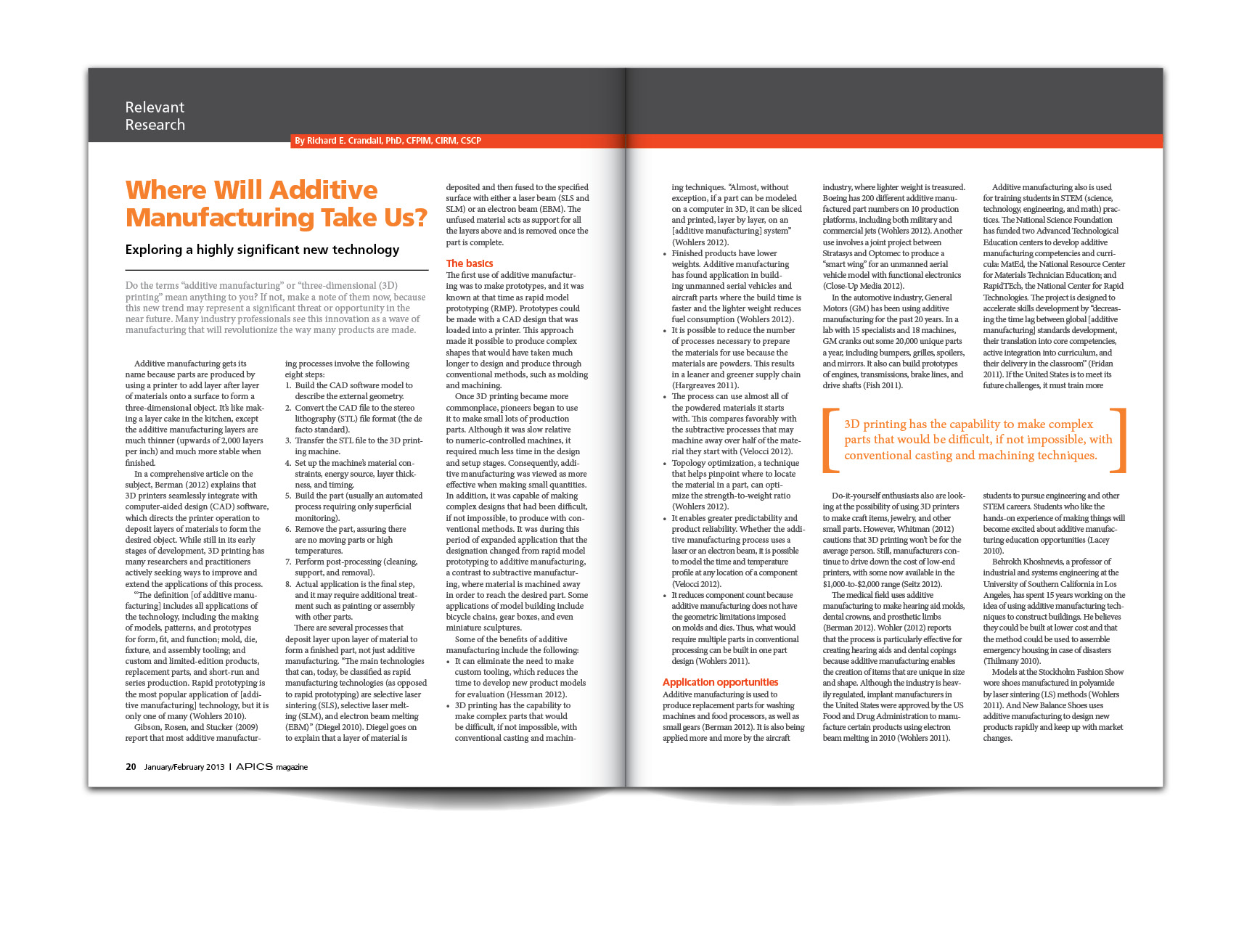
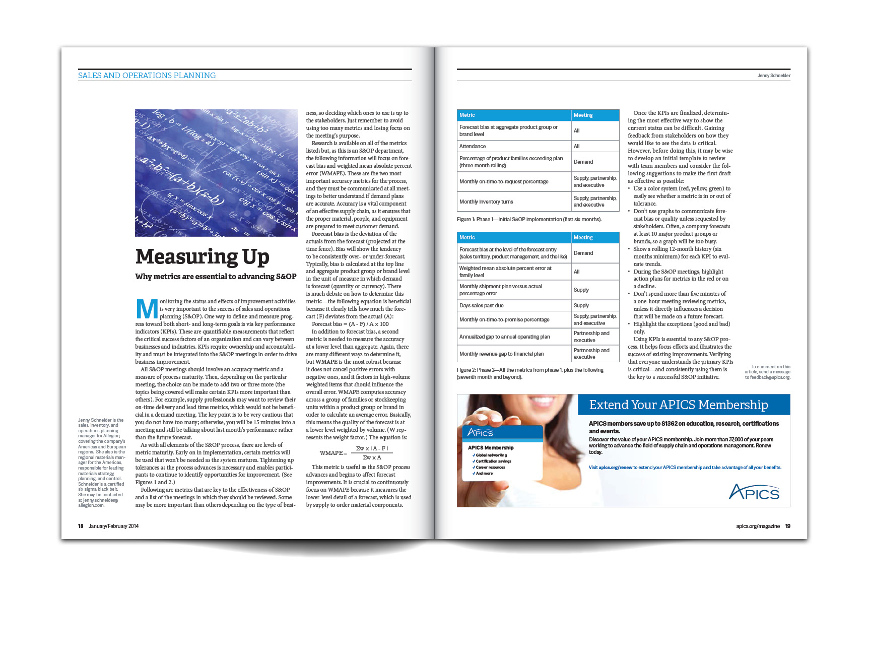
In 2013, APICS The Association for Operations Management decided to rebrand itself. Part of this rebranding included changing the company name to simply APICS, along with a new logo, color palate and fonts for all materials. By the end of 2013 the rebranding would include the company's publication, APICS magazine. The goal was to bring the magazine in line with the new look of APICS materials by giving it a more modern and clean look while also addressing production and quality issues. Below are examples of the redesigning of APICS magazine.
Some to the cover of APICS magazine included making a masthead that tied better with APICS new look. The new masthead (right) uses one of the new APICS fonts. Other changes included adding short descriptions of other feature stories next to the masthead and moving the issue month and issue number from the top left in a box to down next to the address box.
The "Lessons Learned" article is accompanied with an illustration.The new layout allows for the illustration to be much bigger and gets rid of wrap-around text.

